Mobile Web Design : Designing Your Website For Mobile Devices
Look around you at any social setting, restaurant, or on the job...and you would be hard-pressed not to see many iphones or one of the latest mobile devices.
Awareness of how your Web pages are being viewed on mobile devices, is an important consideration in designing web pages that are functional & readable with the sizes of the screens that mobile devices have. When a viewer arrives at your website, it needs to be easy to view & then able to be expanded to be more readable by zooming in; especially with regards to the text.
One of the biggest considerations when building a web page for mobile devices is knowing which type of device viewers are using, making sure the resolution, color options, and available functions are taken into account in the design. Relying on the device to have to try to configure them may not work; so it is up to you to 'build' in as many of these attributes to appeal to as many users as you can.
Tips for Building a User Friendly Mobile Website - For iPhones and Other Mobile Devices
- Test your site out on as many devices as possible, including the iPhone & the other most popular mobile devices. While there are some emulators out there, they really don't give you the same feel as trying to navigate through a website on a tiny little screen.
- Gracefully degrading web pages, are a key factor in keeping visitors at and returning to your website. Enable users to view your pages regardless of the type of browser that's being used; whether it's an older or newer one. Writing your web pages for wide screen devices is ok, however; remember that not every user has one & you will need to make sure that the most important information can be viewed on smaller screens; & some of web page elements may not be viewable like Flash & JavaScript. In fact, certain cell phones cannot manage anything more sophisticated than basic XHTML.
- Having a separate web page available that is designed only for wireless users, that they can easily locate and navigate, is a way to make sure that mobile users requirements are addressed. Putting a link to it at the very top of your home page, helps to insure that they won't leave your site because they were unable to access pages specifically designed for their needs.
Layout Design of Your Web Pages for iPhones
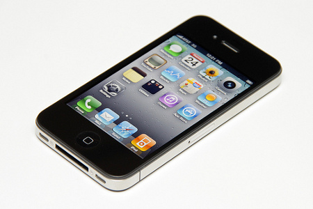
The iPhone and other mobile devices have very small screens, and many will condense columns making them difficult to read without zooming. iPhone users will find a single long column of text is easier to read if you divide it into shorter amounts with some space between them. By creating more pages with shorter segments of text, your users will find it easier to stay on your site.
When designing & writing material for the iPhone, etc. you may be able to avoid having to make major changes to your design format since the iPhone uses Safari to display Web pages. When viewing your site beforehand, you may decide that it looks the same as on a PC, although it will be much smaller. You may want to consider you can improve how your pages are viewed, and some ways in which you can make a viewer's browsing experience better:
iPhones Links and Navigation
On the iPhone typing long URLs can get old and users appreciate shorter ones, and links that contain 3-5 words; are a lot easier to click on than links that only have 1 word. This also applies to long link text. When a viewer is on a page that contains separate words that are next to each other but are linked to different articles, clicking on the right one can be very difficult without inadvertently zooming. If this happens users often leave your site, to look for ones that utilize these concepts and ease of use.
Another mistake that mobile web designers often make when designing for iPhones, etc. is locating the navigation at the very top of the screen. This creates a situation where users have to page through screens and screens of links to find the information they are looking for. If you check out other Web pages specifically designed for cell phones, you'll notice that the content and headline are what a viewer sees 1st, & the navigation is below that.
Placing Images on iPhones
Despite the fact that the iPhone can zoom in on images, it is important to keep these images small. Images must download quickly. in order to make your wireless customer's browsing experience better. If the images are large, they can take up a lot of space on Web pages; in both dimensions and download time.
Recognize that optimizing your images is paramount when designing pages that contain images. Despite the fact that images enhance your site & your pages may look better on a full-screen Web browser, they often don't have the same effect when viewed on a mobile device.
As with navigation, putting big images at the top of your home & other pages, creates long wait-times before a user can view the information & text. Large images can make a page take up to 3-4 screens to load & it not conducive to user friendliness.
Things to Avoid When Designing for Mobile Devices
- Avoid certain design elements whenever possible, when you are designing your page to be mobile friendly. If you need to have these on your page, you can, but make sure that your site can also function without them.
- Flash - most cell phones do not support Flash, so it's not a good idea to include it on your wireless pages.
- Cookies - iPhones have cookie support, however; many cell phones do NOT support cookies.
- Frames - even if the browser supports them, consider the dimensions of the screen. Frames don't work well on mobile devices - making them difficult or impossible to read.
- Tables - iPhones and other smart phones support them, but other wireless devices do NOT support tables and should be avoided in your layout mobile page since users can end up with strange results. If you must use a table, make sure that you do not to nest it within another table. Desktop browsers find nested tables difficult to support, and will load pages more slowly.
- Absolute measures - Do not define the dimensions of objects in absolute sizes such as; pixels, millimeters, or inches....instead, choose relative sizes like 'ems' and percentages. If you define something as 100px wide, it may be displayed on only half the screen on one mobile device, whereas and on another it might appear as twice the width.
- Fonts - Many of the fonts you want to use may not be viewable on mobile devices & cell phones.
Please contact us to learn more about mobile web design for your website
WEBSITE-DESIGN
website design web design mobile web design