Many people forget how important their website's design is. There is a fine line between a well designed website and an over designed website. You can enhance the design of a website (colors, graphics, and other visual elements) by planning it in a similar way that you plan the more functional aspects of your website. By defining your website's objectives, you will establish a clear picture of what your website should look like.
Visual impacts of specific color combinations
The first step in web design is to choose out what color scheme you would like.
Determine what colors represent your business the best. Usually two colors are
enough.
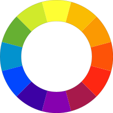
Complementary colors
In color theory, two colors are called complementary if, when mixed in the proper proportion, they produce a neutral color (gray, white, or black).
The use of complementary colors is an important aspect of aesthetically pleasing web design. When placed next to each other, complementary colors make each other appear brighter. On an artistic color wheel, complementary colors are placed opposite one another. Although these artistic complements may not be precise complements according to the scientific definition, most artistic color wheels provide a close proximity.
Warm vs. cool colors
The distinction between warm and cool colors has been important since at least the late 18th century.
Color theory attributes perceptual and psychological effects to this contrast.
Warm colors are associated with daylight and cool colors are often associated with a gray or overcast day. Warm colors are hues from red through yellow, browns and tans included; cool colors are the hues from blue green through blue violet, most grays included.
Warm colors are said to appear more active, while cool colors tend to recede. Warm colors are said to arouse or stimulate the viewer, while cool colors calm and relax. Most of these effects, to the extent they are real, can be attributed to the higher saturation and lighter value of warm pigments in contrast to cool pigments.
Your logo, graphics and buttons
When designing your website's graphics, try to keep the colors down. Lots of colors are not only distracting, they are also larger files. You should make your graphics clear, easy to understand and not overly complex. If you plan to have any effects, such as rollovers, try to do it as subtly as possible.
Before you begin creating your website's graphics, we recommend that you lay the site out without graphics. Instead using graphics place holders to illustrate the colors of your website.Create a rough draft of your home page
Show it to people that would be considered a typical user. Sometimes the best feedback can come from people who aren't too web savvy.
Once you're satisfied with your layout, start creating the graphics and inserting them into your graphics place holders.
It's inevitable that adjustments will be made during your website's design process.
Once you are satisfied with the graphics, then move on to the other pages. We
recommend keeping a similar look and feel throughout your entire website.
To learn more about your website's design, please feel free to contact us vie email or call us at: (888)211-7806
Sharing is caring:
WEBSITE-DESIGN
website design web design